Is the new We ❤️ NYC really that bad?
The answer is yes.
City officials have revealed a new "We ❤️ NYC" campaign aimed at promoting the city's recovery from the COVID-19 pandemic. The campaign is inspired by Glaser's original design in both name and design, but the new version has been met with online ridicule despite the original logo being considered one of the best logos of all time.
Let’s take a trip down memory lane and revisit the iconic original:
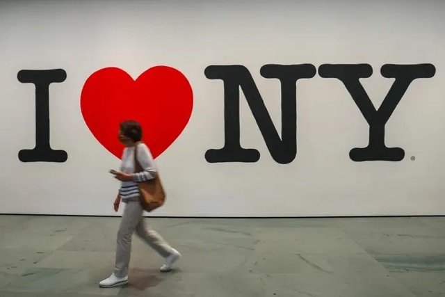
Original “I ❤️ NY” Logo by Milton Glaser
The "I ❤️ NY" logo was created by graphic designer Milton Glaser in 1977 as part of a campaign to promote tourism in New York State. Glaser created the logo pro bono, without any compensation, as a way to give back to the city he loved.
The logo features the iconic red heart symbol, which is tilted slightly to the right and placed between the letters "I" and "NY" in bold, sans-serif type. The logo's design is simple, clear, and instantly recognizable, making it one of the most iconic logos in history.
Glaser's inspiration for the logo came from a combination of factors, including the iconic "LOVE" sculpture by Robert Indiana, which was popular at the time, and the city's struggling economy, which needed a boost from tourism.
The "I ❤️ NY" logo quickly became a cultural phenomenon and was widely imitated and parodied in pop culture. Over the years, the logo has been adapted and updated for various purposes, but the original design remains an enduring symbol of New York City and its spirit.
In recognition of his contribution to the city, Glaser was awarded the National Medal of Arts by President Barack Obama in 2009.
Now let’s get into the reproduction:
Aside from the fact that the campaign and design cost the city an approximated (whopping) $20 million, the logo mark itself is unoriginal, underwhelming, and unnecessary.
The new logo
The updated wordmark reads "WE ❤️ NYC" in a blocky sans serif typeface instead of the typewriter-style font used in the original 1977 design. While the take on Neue Helvetica is a modernized version of the classic typeface and could work under different circumstances, when used to replace an iconic symbol simply falls short.
The new version features a shaded, three-dimensional heart reminiscent of an emoji. No thanks. This *kind of* 3D heart jutting out feels oddly *less* substantial, uglier, and fairly unbalanced in the complete lock-up.
The logo has inconsistent spacing as noted by several designers including design reporter Katie Deighton who was tweeting that it would likely have Glaser "kerning in his grave".
It’s also very unoriginal and the backlash in part is because they chose to remain close enough to the original but not quite. You either change it completely or not at all. Adding a “We” and a “C” is hardly iconic. Adobe's executive vice president of design Scott Belsky agreed to say it lacked "anything that feels timeless or iconic".
While some of the branding and campaign collateral actually looks pretty cool, the new logo looks more like a corporate branding logo than a tourism logo.
Moral of the story: If it ain’t broke, don’t fix it!
and if you’re still reading…here’s a re-imagination of the “We ❤️ NYC” logo by Ryan McGuiness done the right way.